
Every hole you put in a wall is a decision you can only half undo. Filler and paint never quite erase it. So the sensible order is measure, mock up, then drill, and the mock-up is nothing grander than paper and masking tape.
The guidelines below are the ones galleries and designers rely on. Learn them, then break them on purpose.
Eye level is lower than you think
The commonest mistake is hanging pictures too high. Art belongs to the people in the room, so it should meet them at eye level, not hover near the ceiling.
The usual benchmark puts the centre of the picture about 145 to 150 centimetres from the floor. Many galleries use roughly that height because it matches the eye line of most standing adults. Measure to the centre, not the top edge, then work out where the hook goes from the back of the frame. If the picture hangs on a wire or cord, pull it taut and measure from the floor to where the hook will sit, not to the top of the frame.
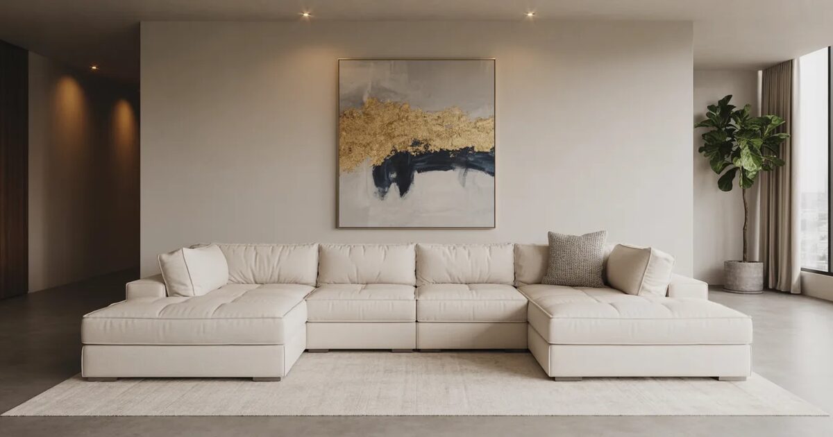
Seated areas change the rule. Over a sofa, console or sideboard, art should relate to the furniture below it rather than to the floor. Leave a gap of around 15 to 25 centimetres above the back of the sofa so the two read as one group. A picture floating far above the furniture drifts, and the wall looks as if two separate decisions were made.
Match the size of the art to the furniture under it
Small pictures on big walls look timid. As a general guide, art above a sofa or bed should be about two thirds the width of the furniture beneath it, either as one large piece or a tidy grouping. If you are unsure, go bigger. One generous piece usually looks more deliberate than three small ones spread apart.
A hallway is different, because you see the art at an angle and in passing. A run of evenly spaced frames suits it, ideally slim ones, so nobody catches a sleeve on the way past. For more on how narrow spaces can carry personality, have a look at my notes on hallway design trends.
Mock up the gallery wall before the first nail
A gallery wall is a group of pictures treated as one composition, and it rewards planning more than any other wall in the house.
Begin with the largest piece, or your favourite, and make it the anchor. Place it slightly off centre at eye level and build outwards. Smaller frames fill the gaps, with a few on the opposite side to balance the weight. Where several pictures sit in a row, give them either a shared centre line or a shared top edge, so the eye has something to follow.
Then lay everything out on the floor in the shape of the wall. Or trace each frame onto paper, cut the shapes out and stick them to the wall with masking tape. Shuffle them until it feels right, and only then mark the nail positions through the paper. Each hole gets made once, and you have already seen the finished wall. Hang the heaviest frames first, then fit the lighter ones around them.
Even gaps, one repeated element
Consistent spacing is what makes a mixed group look intentional. Keep the gap between frames the same throughout, somewhere around 5 to 8 centimetres, and the wall holds together even when the pictures vary wildly.
You have two ways to organise a group. A grid, with frames lined up along their edges, looks calm, formal and architectural. A looser salon-style arrangement, with different sizes interlocking, looks collected and lived in. Pick one and stay with it.
Mixed frames work once you give the group a single point of agreement. It might be a shared frame colour, all black or all warm oak. It might be a white mount around every picture, or a restrained palette in the artwork itself. Choose one repeated element and everything else can vary. If you are deciding which colours to repeat, my guide to choosing a colour scheme for your home will help.
A few extras bring a wall to life:
- A mirror in the group, to bounce light and break up the rectangles.
- A textile, a small sculpture or a shallow shelf for depth.
- One or two pieces without glass, so reflections do not dominate.
- A deliberately empty patch, so the wall can grow as you collect.
Fixings, wiring and light
Use fixings that suit your wall and the weight of the frame. Plasterboard, brick and lath and plaster each need something different, so ask at a good hardware shop if you are unsure. Check for pipes and cables with a detector before you drill, and bring in a qualified professional if the wall may hide wiring. A heavy mirror needs proper fixings. A hopeful nail will not do. Where a frame has two hanging points, use two fixings and a spirit level, otherwise it will creep crooked within a week.
Light is the other half. Art on a wall nobody lights becomes a flat rectangle after dark, and glare on glass can hide a picture all day. Position lamps and wall lights to flatter the group without bouncing straight back at you. My advice on layering lighting in a luxury home covers the options.
Last check: stand in the doorway, squint, and look at the whole group. The silhouette should feel balanced, with no heavy cluster on one side and no stray frames adrift on their own.
If you have a collection waiting for a wall and want a second pair of eyes on the whole room, talk it through with me before the drill comes out.